 Learn hubBlog
Break down the predictive liquidation map — what “predictive” means, how to read the bands and the summary, which thresholds there are.
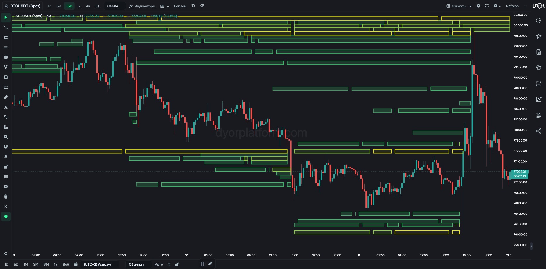
A map of predictive liquidations: where liquidations may happen if price gets there. Bands over the candles.
Predictive means calculated in advance, predicted. The exchange does not publish the prices at which other people's positions get liquidated. A model estimates this: changes in open interest show at which prices positions were opened, and with typical leverage you can see where their liquidation price is. That is how the bands come out. This is a model, not a fact: a band may not trigger, and liquidations may happen where there was no band.
The map updates about once a minute. LIQS indicators show the fact, the map shows a forecast.
See where liquidations may happen. At which prices leveraged positions have piled up and what happens if price gets there.
For example.
How to read it together with limit orders. A cluster on the map is future market orders: if price gets there, the exchange will sell or buy for the band's amount without asking. A large limit bid below price looks like demand. If a warm long-liquidation band sits just below it, the wall will meet not only regular sellers but also forced sells for the band's amount. The more the band outweighs the wall, the further through the wall price goes. The map shows what will come at the wall; without it you only see the wall itself.
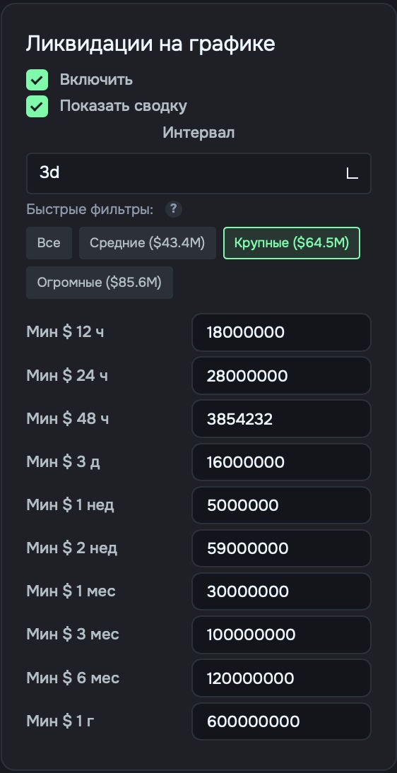
Right rail → Settings (first button) → Coin tab → “Liquidations on chart” card → Enable. Settings are saved separately for each coin.
| Field | Options | Default | What it changes |
|---|---|---|---|
| Enable | on off | off | Show the map on this coin. |
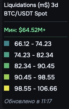
| Show summary | on off | — | A box on the chart: interval, threshold, color scale with amounts for each step, and update time. - Want to know how many dollars stand behind each color — turn it on. |
| Interval | 12h · 24h · 48h · 3d 1w · 2w · 1m 3m · 6m · 1y | 1w | Which position horizon to use: over what period to count accumulated positions. - Want levels from fresh positions — 12h or 24h. - Want everything accumulated over a long period — 1m and longer. |
| Quick Filters | All Medium Large Huge | — | They set the cluster size threshold from the distribution on this coin, like for limit orders. The number in brackets is the current threshold in dollars. - Want only the biggest clusters — Large or Huge. |
| Min $ 12h … Min $ 1y | amount | varies | Your own cluster size threshold for each horizon. Smaller ones are not drawn. A quick filter changes the threshold of the selected horizon. |
Not on the map. On actual liquidations — the metrics COIN LIQS, TOTAL BINANCE LIQS, AGG. LIQUIDATIONS.
Predictive liquidations are calculated in advance: from open interest and typical leverage, the model estimates where positions sit and at what price they will get flushed. Bands over the candles where price has to go. Color — amount, color scale in the summary, length — how long the level lives. This is a model, not a fact. LIQS indicators are the fact, the map is a forecast. An alert can be set only on the fact.
How is the liquidation map different from COIN LIQS?
Correct answer: The map is where liquidations may happen per the model, COIN LIQS is where they already happened
A liquidation map band is…
Correct answer: A model: where positions may get liquidated if price gets there