 Learn hubBlog
Take apart the “Clusters” chart type: what it shows inside a candle, how to enable it and what to configure.
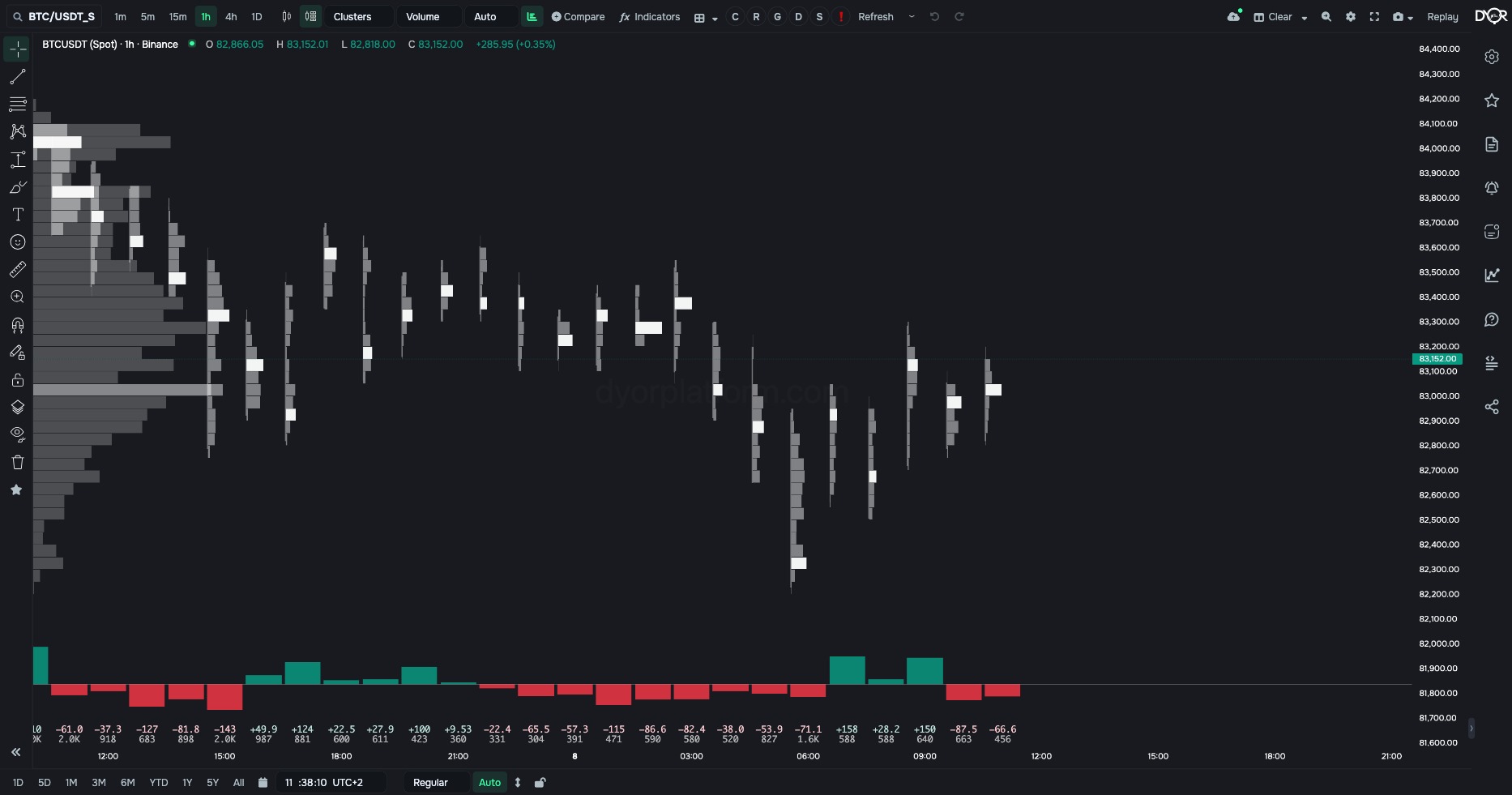
A chart type that breaks the trade volume inside each candle down by price: how much was bought and sold at each price.
Clusters are computed from Binance trades of the coin and market on the chart. The chart type requires a subscription; regular candles stay free.
The “Cluster type” field next to the chart type changes what is counted at each level. All five frames below are the same hourly BTC/USDT candles.
Volume. At a level — the whole trade volume for the candle, buys and sells together. The bars are grey, the candle’s longest level is highlighted in white: that is the POC. At the bottom — the candle’s delta and volume. Good for seeing at which prices the most was traded.
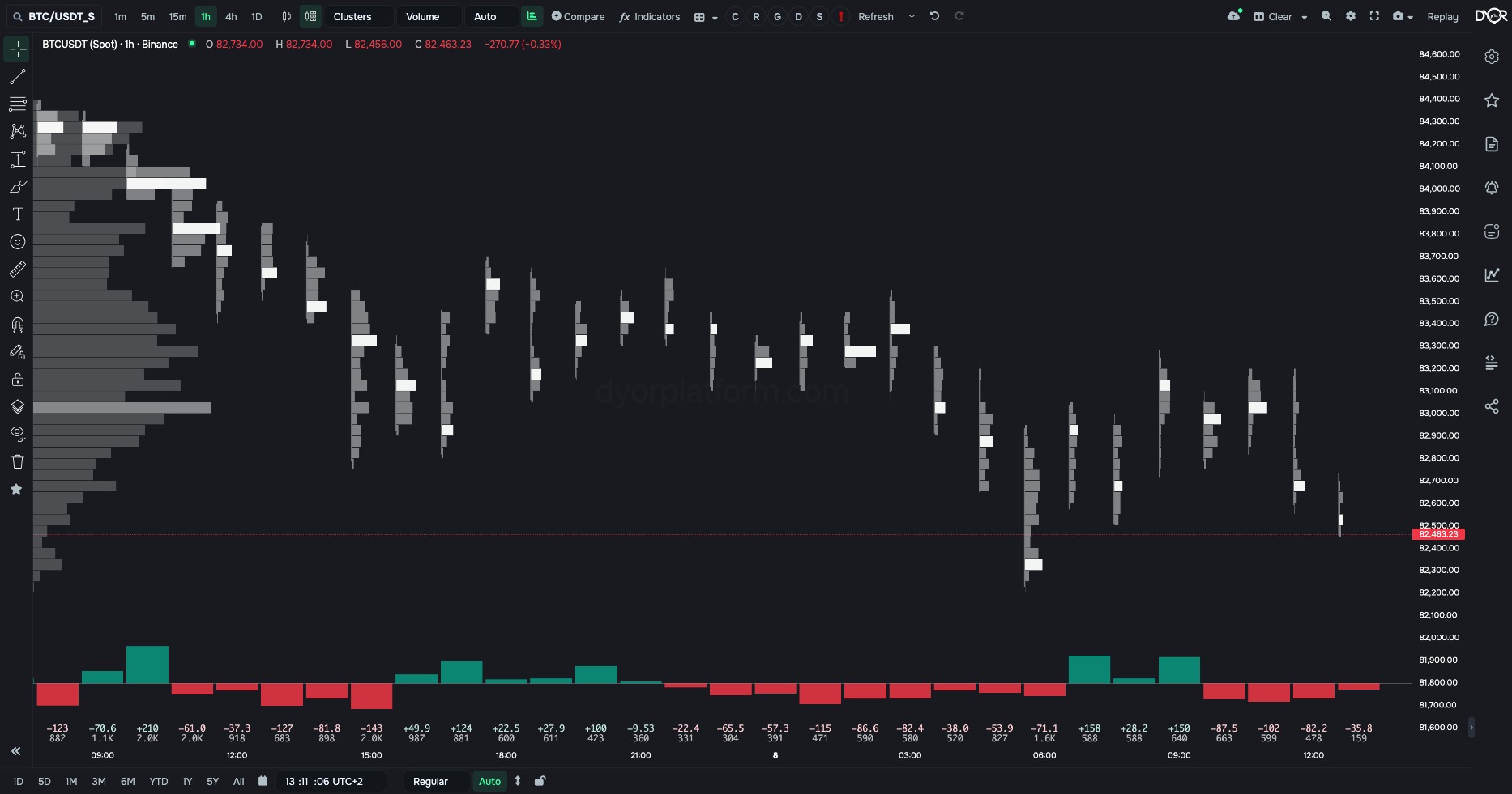
Delta. At a level — market buys minus market sells. A green bar to the right — more buys, a red one — more sells, the length — by how much. You see who was pressing at each price, not how much was traded.
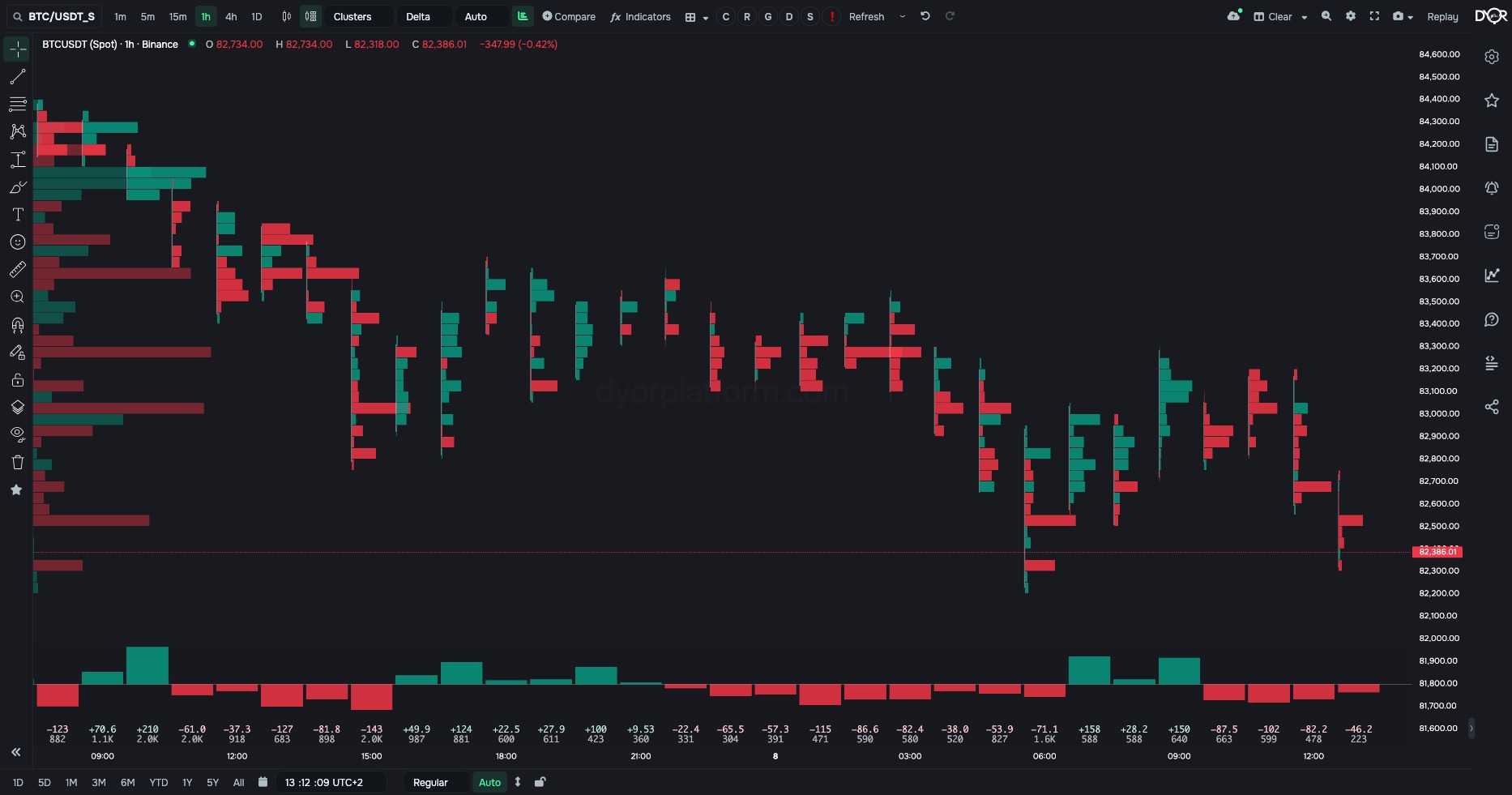
Buys and sells. Both sides separately: sells as a red bar to the left of the candle’s axis, buys as a green bar to the right. This is the most detailed view: you see both the size of trading and the excess at each level.
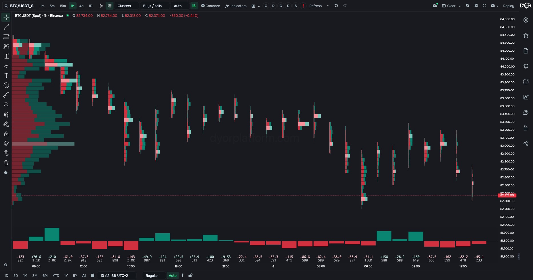
Trades. The same as “Volume”, but the number of trades is counted, not their volume. A level with many small trades is thick here, while one large order is thin. Compare with “Volume”: where they differ, the volume was made by a few large trades.
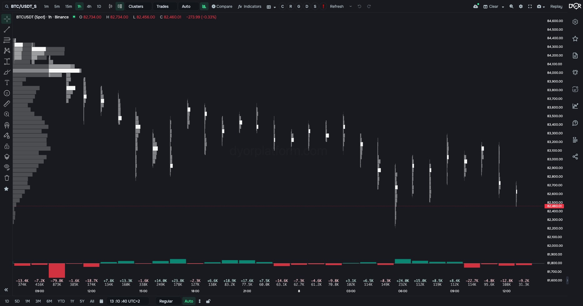
Trades delta. The number of market buys minus the number of market sells. Green — more buys by count, red — more sells. At the bottom — the delta by number of trades and the total trades for the candle.
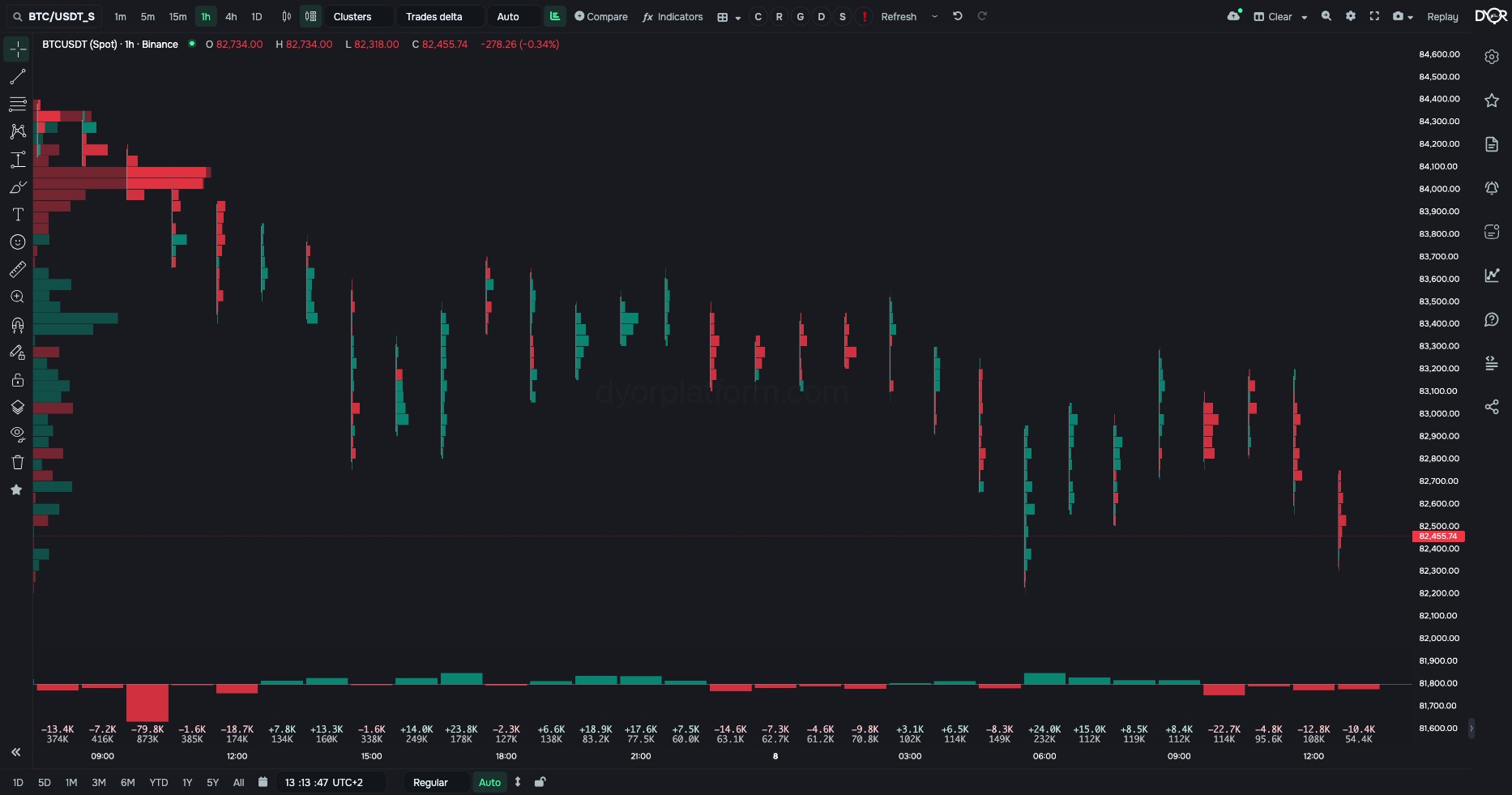
The type changes only what is counted. The price step, POC, value area, imbalance, profile and histogram work in all five.
See at which prices inside a candle the volume went through and who created it: market buyers or market sellers. A regular candle shows only four prices.
For example.
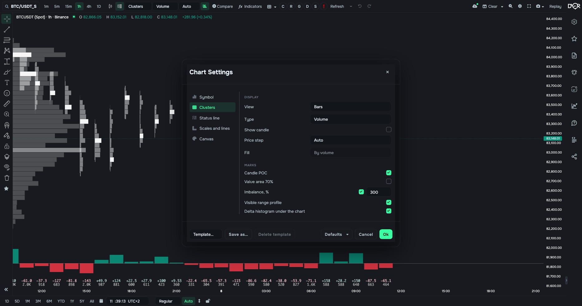
| Field | Options | Default | What it changes |
|---|---|---|---|
| View | Bars Cells with numbers | Bars | How to draw the levels. - Want to see the shape of the volume inside the candle — Bars. - Want to read the numbers at every level — Cells with numbers. |
| Type | Volume Delta Buys and sells Trades Trades delta | Volume | What to count at a level, the same as the quick “Cluster type” field. - Want the whole volume — Volume. - Want the excess of market buys over sells — Delta. - Want both sides separately — Buys and sells. - Want the number of trades instead of volume — Trades. - Want the excess by number of trades — Trades delta. |
| Show candle | on off | off | Draw the outline of a regular candle over the cluster. |
| Price step | Auto ×1 · ×2 · ×5 · ×10 · ×20 · ×50 · ×100 | Auto | The height of one level in price ticks. - Want the platform to pick the step for the scale — Auto. - Want bigger levels and less noise — ×5 and up. - Want finer — ×1. |
| Fill | By volume By delta | By volume | How to colour the cells in the “Cells with numbers” view. - Want brightness by the size of the volume — By volume. - Want the colour by the excess of buys or sells — By delta. |
| Candle POC | on off | on | Mark the level with the largest volume in each candle. |
| Value area 70% | on off | off | Highlight the levels where 70% of the candle’s volume went through. |
| Imbalance, % | on + number | on, 300 | Highlight the levels where one side exceeds the other by the set factor: 300% — three times more buys than sells, or the other way round. |
| Profile for the visible screen | on off | on | The bars on the left: volume by price for all candles on the screen. |
| Delta histogram under the chart | on off | on | The strip at the bottom: each candle’s delta and volume as numbers. |
A chart type cannot be put in an alert. Volume, market buys and sells per bar are available in the COIN TRADES and COIN TRADES Q. indicators, the excess in COIN MARKET DELTA SMART.
Clusters break each candle’s volume down by price: how much was bought and sold at each price. Five value types, two drawing views, a price step, the POC, value area and imbalance marks, the profile and the delta histogram. The chart type requires a subscription.
What does the POC mark in a cluster show?
Correct answer: The price level where the largest volume went through during this candle