 Learn hubBlog
Break down the liquidity heatmap: where exactly the large limit levels sit and what's behind them, where to turn it on and what each setting on the card changes.
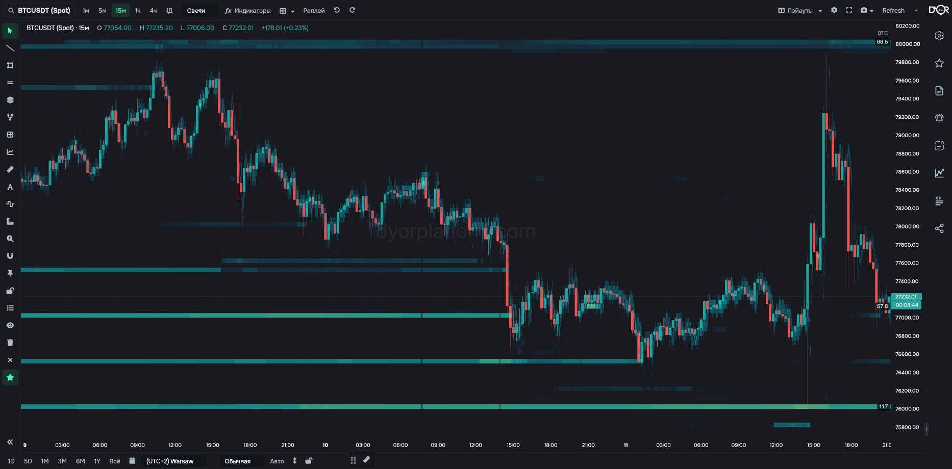
Order book history over the candles. Time on the horizontal axis, price on the vertical.
See where exactly the largest limit levels sit and what's behind them. B&A and RATIO say “bids at 3% have grown”. The heatmap shows at what price they stand: one or many. And a second thing the other indicators don't have. Almost all of them show where something is: money, trades, liquidations. The heatmap also shows where there's nothing — prices without a single wall and without volume. Clusters give you the points, emptiness gives you the distance between them.
For example.
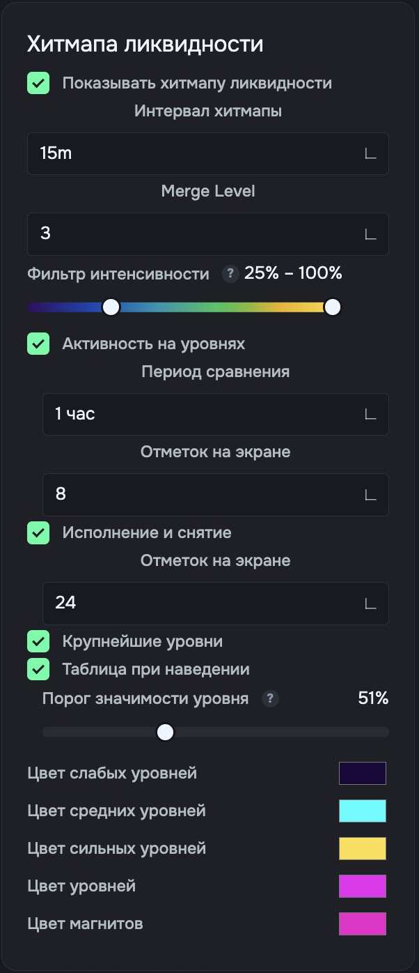
Right rail → Settings (first button) → Coin tab → “Liquidity Heatmap” card → Show liquidity heatmap. Settings are saved separately for each coin.
| Field | Options | Default | What it changes |
|---|---|---|---|
| Heatmap interval | 1m … 1d | 5m | Column step in time. Set it close to the chart timeframe — the columns will line up with the candles. |
| Merge Level | 1 … 10 | — | Merges adjacent price steps. 1 — the price step, 10 — ten times wider. Heatmap ripples with thin bands — increase it. |
| Intensity filter | two sliders | — | Left — below what volume not to show. Right — from what volume brightness is at max. Small orders hide large ones — raise the left one. |
| Level activity | on off | on | Circles where volume was sharply added or pulled over the period. Green — bids, red — asks. Label — with sign and percentage. |
| Comparison period | Adjacent snapshot 15 minutes 1 hour 4 hours | 1 hour | What to compare a level's volume against to decide it changed sharply. - Want to catch quick adds and pulls — Adjacent snapshot or 15 minutes. - Want only large changes over hours — 1 hour or 4 hours. |
| Marks on screen (activity) | 8 16 24 | 8 | How many circles to show. Labels — on the eight largest. |
| Fills and pulls | on off | on | A label at a level when price reaches it: how much was filled, how much pulled, how much added. Based on trades at that price, not on price movement. - Want to see whether a level is held or pulled as price approaches — turn it on. |
| Marks on screen (fills) | 8 16 24 | 24 | How many fill and pull labels to show. |
| Largest levels | on off | off | Top 5 levels within ±10% of price, as bands. The 🧲 icon — the level matches a liquidation map cluster. |
| Hover table | on off | — | Show the boundaries and volume of the band under the cursor. |
| Level significance threshold | 0 … 100% | — | How large a level has to be to get a volume label to the right of the chart. Doesn't go below the left slider of the intensity filter. Too many labels — raise it. |
| Colors | 5 fields | — | Weak, mid and strong levels — three points of the heatmap scale. Level color — the “Largest levels” bands. Magnet color — levels that match a liquidation map cluster. |
Not on the heatmap. An alert on order book volume is set with the metrics COIN B&A and COIN B&A DIFF. An alert on a single large order is a limit alert, see the “Alerts” block.
The heatmap is the order book over time. Price vertical, time horizontal, cell color — how much money stood at that price. B&A gives the sum over a band, the heatmap — at which prices that sum sits: one bright band with darkness behind it, or a ladder of levels. The only layer that also shows emptiness — prices with no orders at all. Turn it on in the right rail → Settings → Coin. The “Level activity” circles mark where volume was sharply added or pulled.
Bids at 3% grew. On the heatmap there's one bright band below price, and below it it's dark. This means…
Correct answer: All the volume sits at one price; below it there are almost no orders until the next band
A dark area on the heatmap between two bright bands is…
Correct answer: Prices with almost no orders