
DYORLearn hubBlog
Home / Learn hub / Start

Supply and demand

5 min · DYOR Education
Goal

Understand where price moves come from and see which DYOR indicators show supply and demand.

Price is where two lists meet: who wants to buy and at what price, and who wants to sell and at what price. Three examples.

100 sellers, 1 buyerThere's one buyer, and he buys from whoever sells cheapest. To make a sale, each seller undercuts the next one. The price goes down until buyers show up at the new, lower price. Supply exceeds demand → price falls.
1 seller, 100 buyersThere's one item, and it goes to whoever pays the most. Buyers outbid each other. The price goes up until sellers show up at the high price. Demand exceeds supply → price rises.
EqualEvery buyer finds a seller at the current price, and vice versa. Nobody needs to outbid anyone. Balance → price holds. It moves the moment one side becomes bigger than the other.
100 sellers · 1 buyersellersbuyersmore supply → price falls1 seller · 100 buyerssellersbuyersmore demand → price risesequalsellersbuyersbalance → price holds
Whichever side is bigger moves the price. Bar length is how many participants are on that side.
Price doesn't change because “the market decided so”, but because one side got bigger than the other. The question is always the same: where is more money right now, on the buy side or the sell side, and which way is that balance moving.

On an exchange both lists literally exist, and they have names — we'll cover them on the next screen.

  • Order book — the list of orders waiting for their price. Bids — buy orders, this is demand. Asks — sell orders, this is supply.
  • Trades — demand and supply that didn't wait and took the market price.

A candle shows only the result — the price. DYOR shows the lists themselves and how they change over time:
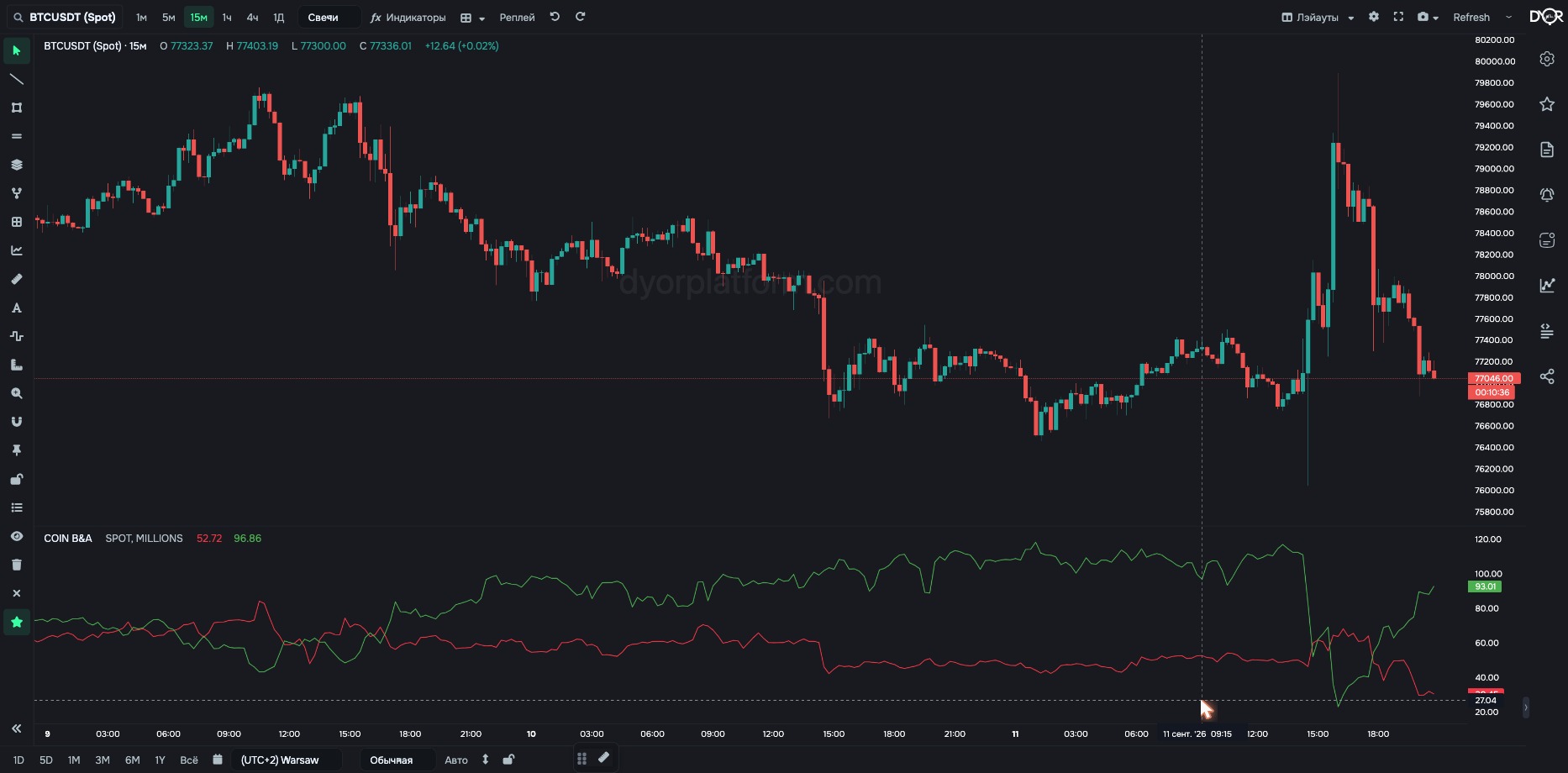
COIN B&A. The green line is how many dollars sit on the buy side within 3% of the price. The red one is the sell side. This is exactly “how many buyers versus how many sellers”, only in money
  • Order book (COIN B&A, RATIO, DEPTH INDEX…) — how much money waits on each side and how far from the price.
  • Trades (COIN TRADES, MARKET DELTA…) — who didn't wait: how much was bought and sold at market.
  • Derivatives (OI, funding, LONG/SHORT, liquidations) — supply and demand with leverage: how many positions are open, who pays to hold them, who got force-closed.
  • TOTAL — the same lists summed across the whole market.

Every indicator in the course is a way to look at supply and demand from a different angle. Each next screen tells you which angle.

Try it yourself
  1. On the same chart, find a bar where the COIN TRADES column is tall and green.
  2. See what the price did on that bar and the next one.
What you should get. You found a moment with more market buyers and saw how the price responded.
Takeaway

Price moves when one side becomes bigger than the other. On an exchange both sides are literally visible. Order book: who waits for their price. Trades: who took the market price. Derivatives: the same with leverage. DYOR indicators show these lists over time.

Quick check

100 buyers and 1 seller — what happens to the price?

Show answer

Correct answer: It rises: buyers outbid each other

← Previous lesson Next lesson →
See these concepts live on real Binance data — the DYOR workspace is free to start.
Open DYOR Platform